
After graduating last June, I hightailed it to my new position at the University of Texas at Austin, where I was pretty sure I had moved as far away as possible from National League baseball. Since the the poor hapless Astros were shifted to the American League last year, my best hope to see a Giants game would have to be interleague play, which in any given year is no guarantee. With the release of the MLB 2014 schedule, I was sad to see that my beloved Giants have no upcoming interleague games with either the Texas teams.
Inspired by a map of all the McDonalds locations in the US used to determine the “McFurthest Spot”, I decided to visualize my sorrow (actually I just thought it would make a fun project that would result in pretty plot).
My go-to tool for all things math and visualization related is R, so I poked around and found that the ggplot2 package was probably what I was after. I’ve spent a lot of time with the core R graphics, but know I’ve been missing out by not looking into ggplot2. So I dove in and came up with this:
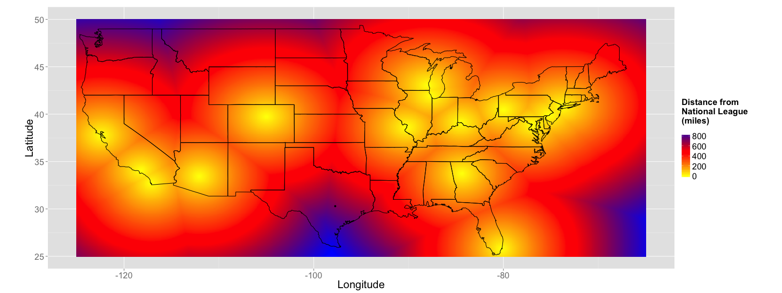
This map of the US is colored by distance to nearest NL ballpark, with Austin marked by a black dot in Texas. While the southern tip of Texas is indeed as far as you can go from the NL, Austin is actually closer than parts of Washington and Idaho, with the distance between St. Louis and Austin being comparable to the distance to the distance between San Francisco and Seattle.
For completeness sake, I also put together a map showing the AL:
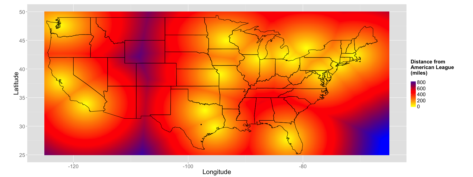
There you can see Austin, deeply embedded in heathen designated hitter country. Oh well, at least it will be easy to catch an A’s game.
Anyway, if you want to play with your own “McFurthest”-style maps, I’ve posted the code used to generate these plots over on my brand spanking new github profile.